
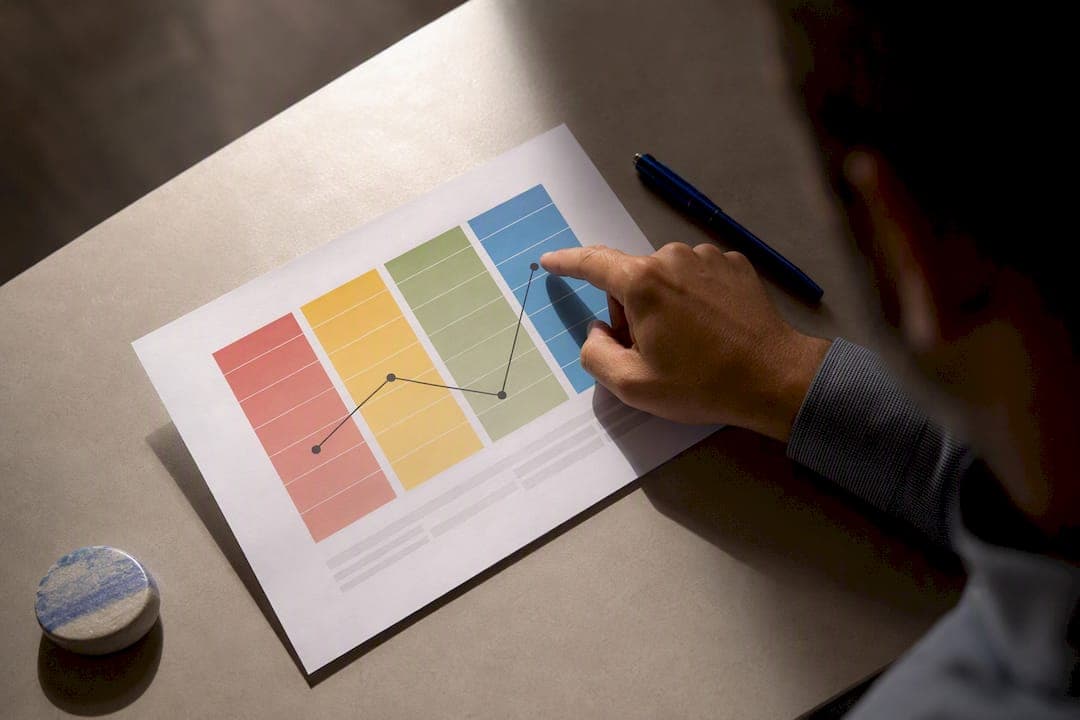
A DISC graph plots your Dominance, Influence, Steadiness, and Conscientiousness scores above or below a midline, showing how strongly each trait shapes your behavior. Start with the natural or general graph, since it reflects your baseline tendencies before any workplace mask goes on. Then compare it to your adapted graph. Where the two diverge sharply, you have found the place where you are stretching yourself to meet the demands of a role.
TL;DR:
- Large gaps between natural and adapted graphs suggest significant role demands are forcing behavioral shifts that may impact long-term comfort and performance.
- Elevated scores across all four traits indicate high effort, which could signal burnout risk if sustained over time.
- Tightly clustered midline points usually show a person is temporarily adapting rather than displaying a stable personality pattern.
- The shape of the graph, especially sharp peaks or blends, reveals specific behavioral tendencies that influence communication and decision-making styles.
- Comparing natural and stress graphs helps identify how behavior changes under pressure, guiding targeted coaching and role alignment.
Table of Contents
- Disc Graph Explained: The Basics Behind the Visual
- Quick Reference: The Four DISC Styles at a Glance
- The Three Graphs Explained: Natural, Adapted, and Stress
- How to Read a DISC Graph: Midline, Intensity, and Shape
- Common Graph Patterns and What They Signal
- Three Practical Steps to Apply Your DISC Graph This Week
- How Discassess Supports Faster, Clearer Interpretation
- Reading the Small Details: Curves, Bars, and Scores
- Is DISC Graph Methodology Actually Backed by Research?
- What Beginners Get Wrong About DISC Graphs
- A Practical Way to Keep Practicing: The Poster and a Sample Report
- Where to Read More on DISC Graph Interpretation
- Sources
Disc Graph Explained: The Basics Behind the Visual
DISC theory describes four behavioral tendencies, and the graph is simply the picture of how much of each one shows up in you. Reports typically display this through a bar or plotted-line format, with every score measured against a midline that represents an average or neutral point.
Here is what shapes that visual:
- Bars or curves mark where your score for D, I, S, and C falls on the scale
- The midline acts as the reference point separating "more expressed" from "less expressed"
- Three separate graphs appear in most full reports, each capturing a different context
One clarification worth sitting with: a graph describes a behavioral preference, not a permanent label stamped onto your character. Growth, changing roles, and even a particularly hard season at work can shift how the lines move. If you are searching for disc graph meaning because a report just landed in your inbox, this is the mental frame to hold before you look at a single number: it is describing patterns of behavior, not verdicts about who you are as a person.
Quick Reference: The Four DISC Styles at a Glance
Once you know what each letter tends to look like in daily life, mapping your peaks to behavior gets much faster.
- Dominance (D): Results-driven and decisive. In meetings, this shows up as someone who wants the bottom line first and pushes toward a decision rather than lingering on discussion.
- Influence (I): People-focused and persuasive. This style talks through ideas out loud, builds rapport quickly, and tends to sell a vision before nailing down the details.
- Steadiness (S): Steady and dependable. You will see this in someone who protects routines, supports teammates quietly, and resists sudden change without a clear reason.
- Conscientiousness (C): Careful and precise. This shows up as the person double checking data, asking about the process, and slowing a decision down until the quality bar is met.
Most people are not a pure single letter. A high D paired with a moderate I, for example, produces someone who drives hard toward results but also wants buy-in along the way.
Pro Tip: Look at your top two styles together, not just your highest point. A D/C blend behaves very differently under pressure than a D/I blend, even though both are "high D."

The Three Graphs Explained: Natural, Adapted, and Stress
Most professional DISC reports generate three separate graphs, and each one answers a different question about you. Vendors label them differently, so a quick translation guide helps before you dig into interpretation.
- Graph 3, natural or general (sometimes called "core" or "private self"): This is your baseline, the behavior you default to when nobody is watching and no role demands are pulling you in a direction. Most practitioners recommend starting here, because it anchors everything else you will read.
- Graph 1, adapted or work (sometimes called "mask" or "position-adjusted"): This shows how you have modified your natural style to meet the demands of your current role. A moderate shift is normal and healthy. A dramatic shift between Graph 3 and Graph 1 is worth a second look, since it often means the job is asking you to operate against your grain for extended stretches.
- Graph 2, stress or intuitive (sometimes called "instinctive" or "under pressure"): This graph estimates how you tend to behave when things get difficult, deadlines tighten, or conflict shows up. It is less about daily behavior and more about your fallback pattern when the normal rules stop applying.
Reading these in sequence, natural first, then adapted, then stress, gives you a story instead of three disconnected charts. You are watching how a baseline personality bends under role pressure and snaps (or doesn't) under real stress.
How to Read a DISC Graph: Midline, Intensity, and Shape
Understanding disc graphs comes down to three visual habits, and none of them require memorizing a manual.
- Midline position: A score above the midline means that trait is more expressed than average; below the midline means it is less expressed. Neither direction is good or bad on its own.
- Distance from the midline: The farther a point sits from the midline, the more that trait drives your behavior. Points sitting close to the midline suggest flexibility rather than a strong pull in either direction.
- Category or Intensity Index: Some reports include a numeric score alongside the graph, similar to the category scoring shown in practitioner explainer PDFs, such as a "7344" pattern. Treat these numbers as a supplement to the visual, not a replacement for it.
- Overall shape: A single sharp peak signals one dominant driver. Two points elevated together signal a blend. A graph where every point sits close to the midline suggests a highly adaptable, situational style rather than a fixed pattern.
Picture a graph with D and C both well above the midline while I and S sit near it. That combination usually points to someone who moves fast, insists on accuracy, and has little patience for small talk before getting to the task. The shape told you that before you read a single word of narrative text.
Common Graph Patterns and What They Signal
Coaches and trainers watch for a handful of recurring patterns, and each one carries a different practical implication.
- Over Shift: Every point sits above the midline. This can mean high output, but it is also a documented signal of strain, since sustaining elevated behavior across all four traits at once takes real effort. Watch for burnout risk here, not just high performance.
- Under Shift: Every point sits below the midline. This often reflects disengagement, low energy, or a temporary period of withdrawal rather than a stable personality trait.
- Transition (sometimes called Chameleon): All four points cluster tightly around the midline. This usually reflects a temporary adaptation phase, someone learning a new role or context rather than a settled behavioral style. Timing matters here; a graph taken during a job change looks very different from one taken six months later.
- Delta between graphs: Measuring the gap between your natural and adapted graphs is one of the most useful diagnostic habits you can build. A small, consistent gap is normal. A large, persistent gap across multiple traits is worth raising in a coaching conversation about role fit.
None of these patterns diagnose a problem by themselves. They flag where a closer conversation, not a snap judgment, is warranted.
Three Practical Steps to Apply Your DISC Graph This Week
Interpretation only pays off once you act on it, and you do not need a big program to start.
- Read natural first, then adapted, and name the two biggest shifts. Do not scan all four traits equally. Find the two with the largest gap between Graph 3 and Graph 1, since those are where role pressure is asking the most of you.
- Pick one communication adjustment tied to your top two styles. If you lead with D and C, try softening your delivery with one open question per conversation for two weeks and see how the response changes.
- Use a short coaching script to talk about fit. Ask a colleague or coach: "Where does my adapted graph diverge most from my natural one, and does that match how I feel at the end of a workday?" Schedule a reassessment in three to six months rather than treating one report as permanent.
Pro Tip: Write your two biggest shifts on a sticky note before your next team meeting. Checking it mid meeting is a fast way to notice yourself adapting in real time.
How Discassess Supports Faster, Clearer Interpretation
Reading a report alone in a spreadsheet is harder than it needs to be, which is exactly why Discassess built its platform around instant, visual reports rather than raw score dumps.
- Instant reports turn your natural, adapted, and stress graphs into clear visuals the moment you finish the assessment
- Group management and admin tools let team leaders pull multiple reports side by side, useful when comparing communication styles across a small staff
- Downloadable coaching resources give leaders discussion questions to use directly with the delta method described above
- Educational content, including a visual Poster of the DISC Wheel, helps teams keep the four styles fresh in memory long after the initial report
These features exist because a graph only helps you if you can act on it quickly, in a team meeting or a one-on-one, without needing a certification to translate it first.
Reading the Small Details: Curves, Bars, and Scores
The individual marks on a DISC graph carry more information than a quick glance suggests, and learning to read them slows down misinterpretation.
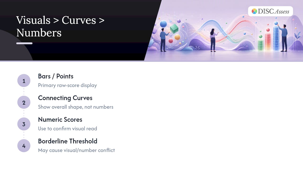
Bars or plotted points represent your raw score for each of the four dimensions on that particular graph. A bar reaching high above the midline for Influence, for instance, tells you that trait is strongly expressed in that context, whether natural, adapted, or stress.
Curves connecting the points matter less for the numbers themselves and more for the shape they form across the four dimensions. A steep curve, one that swings sharply from a high D down to a low S, describes someone whose behavior contrasts strongly depending on the trait in question. A flatter curve suggests more balance across the four styles, even if none of them sit particularly high.
Numeric scores, when a report includes them, quantify what the visual already shows. These often appear as a short sequence of numbers, one per trait, and function best as a cross check against your read of the graph rather than a separate data point to memorize. If your visual read says "high D, moderate C" and the numbers confirm that ranking, you can trust your interpretation. If they conflict, it usually means a score sits close enough to a threshold that the visual and the number are describing the same borderline case differently.
Treat the graph as the primary read and the numbers as confirmation, not the reverse.
Is DISC Graph Methodology Actually Backed by Research?
DISC theory traces back to psychologist William Moulton Marston's work on human behavior, and it has been adapted by numerous assessment providers since, each with its own scoring model and graph format. The Wikipedia overview of DISC assessment is a useful starting point for readers who want the broader history and the range of ways vendors have built on Marston's original framework.
It is worth being direct about what DISC is and is not. It is not a clinical diagnostic instrument, and no reputable provider markets it as one. What it offers instead is a structured, self-reported framework for describing behavioral tendencies in familiar, plain language terms that teams can actually use in a conversation. The value shows up in application: a graph that helps two coworkers understand why one wants to talk through a decision out loud while the other wants three days to think it over has done its job, regardless of how it would perform on a laboratory personality battery.
That practical framing, tool for communication rather than fixed label, is why most credible DISC providers pair the graph itself with coaching guidance rather than handing someone a chart and walking away.
What Beginners Get Wrong About DISC Graphs
The most common mistake is anchoring on your highest single point and ignoring everything else. Your second-highest style usually shapes your behavior nearly as much.
Practice by predicting five people you know well before you see their graphs. The gap between your guess and their actual results teaches you more than any manual, and it is a habit worth returning to alongside a poster or reference resource while you build the skill.
— Tres
A Practical Way to Keep Practicing: The Poster and a Sample Report
If you want a fast way to keep the four styles straight without pulling up a report every time, a Poster of the DISC Wheel is a simple, visual reference for your office or coaching space.
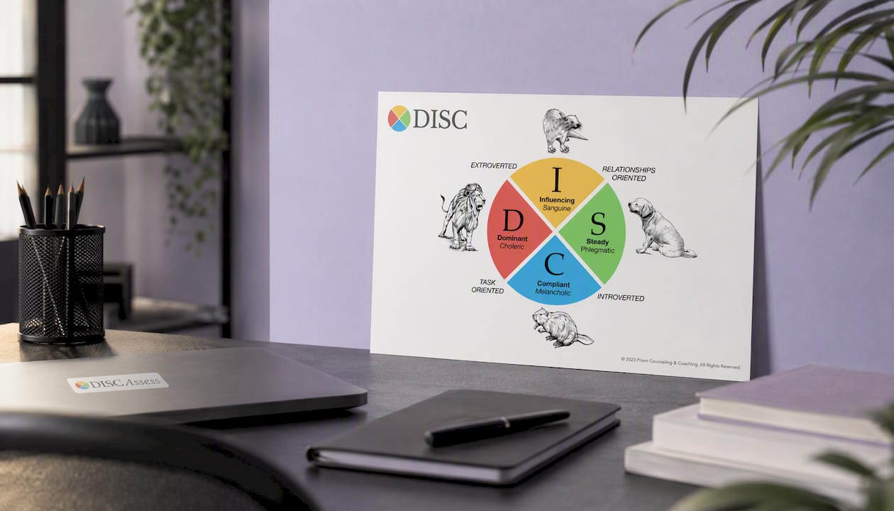
It puts D, I, S, and C side by side with the workplace anchors covered earlier, so a team leader can point to it mid conversation instead of hunting through a report. Discassess built its platform around that same idea: reports that are instant and visual, not buried in jargon you need a certification to translate. Small business owners, coaches, and nonprofit leaders use the group management tools to run assessments across a whole team and compare graphs side by side in one place. If you are still working from a single report, a good next step is running a sample assessment yourself to see how your own natural and adapted graphs compare, and deciding from there whether a group package makes sense for your team.
Where to Read More on DISC Graph Interpretation
- Building self-awareness at work, connecting DISC-based insight to broader leadership habits
Sources
- How to Read DISC Personality Assessment and Test Results
- An explanation of the DISC behavioral style graph (PDF)
- 10 Important Things to Know When Interpreting DISC Graphs